 in the Custom Screens area to
start a new screen.
in the Custom Screens area to
start a new screen.You can access the CUOnline - Screen Generator tool when adding or editing custom forms through the Custom Forms Configuration or Supplemental Screen Configuration workflows.
If you access Applied Epic through a web browser, you must install all components from Help > Connection Suite (including the CUOnline item in the Optional Connections section) to configure custom forms. Otherwise, you can only use the Screen Generator with Applied Epic installed locally on your computer.
Click the Add
button
in the Custom Screens area to
start a new screen.
To work on an existing screen, click on the custom form in the list and then do one of the following:
Click the Edit  button beside the list.
Double click the screen name.
In the Screen Generator window, use the menubar to assist with formatting:
File
Edit
Format
Align: Click and drag over the items you want to align, or click each item while pressing [Shift].
Options
Help
The screen generator is comprised of the following areas:
Treeview: Screens that are available to be edited display in the treeview
To add a control to the screen, do one of the following:
Double click on the control. Move the item to the desired part of the canvas.
Drag the control to the appropriate area on the canvas.
The following controls are available:
Use this control to add a logo to the screen.
The following property options are available for logos.
LogoName
Behavior
TabOrder: Enter the appropriate number in this field. Pressing the [Tab] key on this screen will move the cursor in the order specified here.
Tag Name: Label the logo in this field.
Layout
Location: Gives the X and Y axis location of the selected item. Change these values to move the item, or drag the item on the screen manually.
X: This is the X axis location of the selected item. Change this number to move the item left or right, or drag the item on the screen manually.
Y: This is the Y axis location of the selected item. Change this number to move the item up or down, or drag the item on the screen manually.
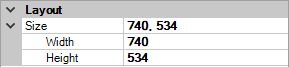
Size: Gives the length and width in pixels of the selected item. Change these values to resize the item, or drag the handles on the item on the screen to resize it manually.
Width: This is the width of the selected item. Change this number to change the item's width, or drag the handles on the item on the screen to resize it manually.
Height: This is the height of the selected item. Change this number to change the item's width, or drag the handles on the item on the screen to resize it manually.
Use this control to label items or add text.
The following property options are available for labels.
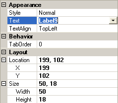
Appearance
Text: Type the desired text in this box.
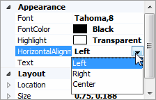
TextAlign: Click in the field to activate the down arrow, and then choose from the following:
Behavior
LinkTo: If you want the label to be a link, enter the URL in this field.
TabOrder: Enter the appropriate number in this box. Pressing the [Tab] key on this screen will move the cursor in the order specified here.
Layout
Location: Gives the X and Y axis location of the selected item. Change these numbers to move the item, or drag the item on the screen manually.
X: This is the X axis location of the selected item. Change this number to move the item left or right, or drag the item on the screen manually.
Y: This is the Y axis location of the selected item. Change this number to move the item up or down, or drag the item on the screen manually.
Size: Gives the length and width in pixels of the selected item. Change these numbers to resize the item, or drag the handles on the item on the screen to resize it manually.
Width: This is the width of the selected item. Change this number to change the item's width, or drag the handles on the item on the screen to resize it manually.
Height: This is the height of the selected item. Change this number to change the item's width, or drag the handles on the item on the screen to resize it manually.
Use this control to place a labeled box around related control items.
The following property options are available for group boxes.
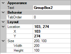
Appearance
Text: Enter the desired text in this field. This is the text that displays at the top of the box to identify the group.
Behavior
TabOrder: Enter the appropriate number in this field. Pressing the [Tab] key on this screen will move the cursor in the order specified here.
Layout
Location: Gives the X and Y axis location of the selected item. Change these values to move the item, or drag the item on the screen manually.
X: This is the X axis location of the selected item. Change this number to move the item left or right, or drag the item on the screen manually.
Y: This is the Y axis location of the selected item. Change this number to move the item up or down, or drag the item on the screen manually.
Size: Gives the length and width in pixels of the selected item. Change these values to resize the item, or drag the handles on the item on the screen to resize it manually.
Width: This is the width of the selected item. Change this number to change the item's width, or drag the handles on the item on the screen to resize it manually.
Height: This is the height of the selected item. Change this number to change the item's width, or drag the handles on the item on the screen to resize it manually.
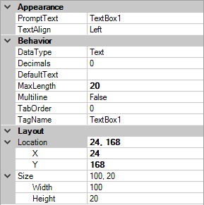
Use this control to add a text box where a user can enter information on the screen.
The following property options are available for text boxes.

Appearance
TextAlign: Click in the field to activate the down arrow and then choose from the following:
Left
Right
Center
Behavior
DataType: Select the type of data that can be entered in this field. Click in the field to activate the down arrow and then choose from the following:
Decimals: Enter the number of decimal places allowed in this field.
DefaultText: If default text should display in the text box, type it into this field.
MaxLength: Enter the maximum number of characters allowed in this text box.
Multiline: Dictate whether the text box can contain multiple lines of text. Click in the field to activate the down arrow and then choose from the following:
True
False
TabOrder: Enter the appropriate number in this box. Pressing the [Tab] key on this screen will move the cursor in the order specified here.
TagName: This is the name of the field.
Layout
Location: Gives the X and Y axis location of the selected item. Change these values to move the item, or drag the item on the screen manually.
X: This is the X axis location of the selected item. Change this number to move the item left or right, or drag the item on the screen manually.
Y: This is the Y axis location of the selected item. Change this number to move the item up or down, or drag the item on the screen manually.
Size: Gives the length and width in pixels of the selected item. Change these values to resize the item, or drag the handles on the item on the screen to resize it manually.
Width: This is the width of the selected item. Change this number to change the item's width, or drag the handles on the item on the screen to resize it manually.
Height: This is the height of the selected item. Change this number to change the item's width, or drag the handles on the item on the screen to resize it manually.
Use this control to add a dropdown menu where a user can select an item from a list.
The following property options are available for combo boxes.
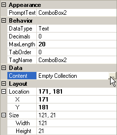
Appearance
Behavior
DataType: Select the type of data that can be entered in this field. Click in the field to activate the down arrow and then choose from the following:
Decimals: Enter the number of decimal places allowed in this field.
MaxLength: Enter the maximum number of characters allowed in this dropdown menu.
TabOrder: Enter the appropriate number in this box. Pressing the [Tab] key on this screen will move the cursor in the order specified here.
TagName: This is the name of the dropdown menu.
Data
Content:
Click in the field
to activate the ellipsis (...) button. Click the
ellipsis button
to select a table type.
Select the appropriate radio
button:
Use an existing user defined table
Create a new user defined table with no defaulting
Create a new user defined table from a standard table
Create a new user defined table defaulting from an existing user defined table
Layout
Location: Gives the X and Y axis location of the selected item. Change these values to move the item, or drag the item on the screen manually.
X: This is the X axis location of the selected item. Change this number to move the item left or right, or drag the item on the screen manually.
Y: This is the Y axis location of the selected item. Change this number to move the item up or down, or drag the item on the screen manually.
Size: Gives the length and width in pixels of the selected item. Change these values to resize the item, or drag the handles on the item on the screen to resize it manually.
Width: This is the width of the selected item. Change this number to change the item's width, or drag the handles on the item on the screen to resize it manually.
Height: This is the height of the selected item. Change this number to change the item's width, or drag the handles on the item on the screen to resize it manually.
To resize an item, click on it and drag the edges of the box surrounding it, or click on the on-screen item and use the Size, Width, and Height fields in the properties area.
You can place an item in one of two ways:
Note: X and Y coordinates are specified for the upper left corner of the selected item.
The selected item is surrounded by small squares. Click on a square and drag it to change the highlighted object's size.
Click the item on the screen that identifies the data to populate under a column heading, and then enter text in the Column Heading field of the Schedule Item area. This specifies the column heading that will display, with the data populated to this field listed below it.
Enter the appropriate Column Number in the next field. Columns display in numerical order from left to right in the schedule.
For each field on the screen, enter the appropriate number in the TabOrder box of the Properties area. Pressing the [Tab] key on this screen will move the cursor in the order specified here.
You can also set the tab order by doing the following:
To exit the Screen Generator, click File > Exit or click the X in the upper right corner of the window. Click File > Exit a second time to save changes for the Screen Generator session.
On the Custom Form screen, click Finish to ensure that the changes are updated for the custom form, or click Cancel to undo any changes made during the editing session for the selected custom form.
To copy or cut an item on the screen, right click on the control and select Copy or Cut.
To paste an item from the screen, right click on the part of the screen where the object should be pasted and select Paste.
Click on the object to highlight it. Do one of the following:
