The following charts are available in the Dashboards module of the Home screen. Click on any chart to drill down to a detailed view of it and access additional filtering options.
In this view, you can hover over a chart segment to display a tooltip containing more detailed counts for it (if tooltips are available for that chart type). Click on a chart segment to display a table of the data used to calculate it. The Description of each opportunity in the table functions as a link; click the Description to navigate directly to detail for that opportunity.
To resize the columns in the detail list for a dashboard, click and drag the splitter between the column headers or double click near a splitter to fit that column to the width of the data.
Click the Back button to return to the main Dashboards view from the drilldown view of any chart.
The following dashboards are available for any Applied Epic user to view. However, in order to see data in these dashboards, you must be a member of a sales team and be listed as the Owner of one or more opportunities.
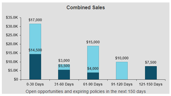
This stacked bar chart shows the total value of your pipeline for New Business Opportunities, Renewal Opportunities, and Expiring Policies. The chart is separated into three bars representing opportunities with targeted close dates and policies with expiration dates within 0-30, 31-60, 61-90, 91-120 and 121-150-day time frames. Each bar shows the value of the total pipeline, segmented by type of business, over its specified time frame.
Select Premium or Revenue from the Opportunity Value dropdown menu to view the value of your opportunities on a premium or revenue/commission basis. Select whether to display Annualized or Estimated premium or revenue values from the Policy Value dropdown menu.
New Business Opportunities values display in dark blue. Renewal Opportunities values display in light blue. Expiring Policies values display in medium blue. To show or hide any of these categories of chart values, click on its label in the legend on the right hand side of the chart.
Note: The Renewal Policies values in the chart are calculated at the policy level, rather than the line level.
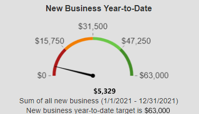
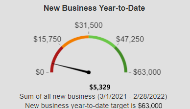
This gauge indicates your progress toward your yearly sales target, based on a comparison of the value of the new business opportunities you have closed as Won and the total of your sales targets configured in Employee/Broker Detail. As you make progress toward your sales targets throughout the year, the needle will move toward the green area on the right. If you exceed your sales targets, the needle will remain at 100%.
Note: Decimal values are rounded to the nearest thousand, million, or billion (depending on the scale of the chart).
Select Premium or Revenue from the Value dropdown menu to display monetary values on either a premium or a revenue/commission basis.
This funnel displays your new business opportunities segmented by Stage, providing insight into the stage in the sales process in which your opportunities are concentrated and the value of the opportunities in each stage.
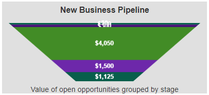
To filter the chart by Target Close Date, enter your desired Target Close Start and End dates, or click the calendar button to select a date. Select Premium or Revenue from the Value dropdown menu to display monetary values on either a premium or a revenue/commission basis.
Each Stage of your sales process (as set up in Opportunity Stages Configuration) displays in a different color. The height of each funnel segment represents the Premium or Revenue value of the opportunities currently in that Stage. To show or hide any of these Stages, click on its label in the legend on the right side of the chart.
This funnel displays your expiring Policies or renewal Opportunities, segmented by expiration dates within the 0-30, 31-60, 61-90, 91-120 and 121-150-day time frames, and the premium value of those policies or opportunities.
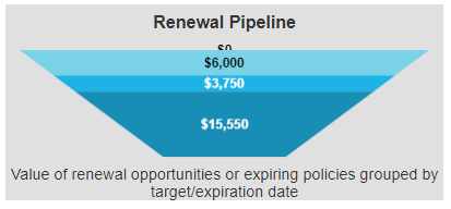
Policies must meet the following conditions to display in this chart:
Opportunities must meet the following conditions to display in this chart:
Select Opportunities or Policies from the Renewals dropdown menu to view either renewal opportunities or renewal policies in the chart. Select Premium or Revenue from the Opportunity Value dropdown menu to view the value of your opportunities on a premium or revenue/commission basis. Select whether to display Annualized or Estimated premium or revenue values from the Policy Value dropdown menu.
Each range of expiration dates displays in a different color. The height of each funnel segment represents the Premium or Revenue value of the Opportunities or Policies with expiration dates within that range. To show or hide any of these date ranges, click on its label in the legend on the right side of the chart.
This pie chart displays the ratio of won opportunities to lost opportunities, based on the original estimated value of each opportunity.
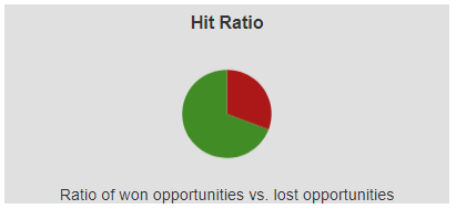
To filter the chart by Closed Date, enter your desired Closed Start and End dates, or click the calendar button to select a date. Select Premium or Revenue from the Value by dropdown menu to display monetary values on either a premium or a revenue/commission basis.
The following dashboards are only available for users associated to sales teams as Sales Managers to view.
This stacked bar chart shows the total value of the team’s pipeline for both new business and renewal opportunities, as well as expiring policies. The chart is separated into three bars representing opportunities with targeted close dates and policies with expiration dates within 0-30, 31-60, 61-90, 91-120 and 121-150-day time frames. Each bar shows the value of the total pipeline, segmented by type of business, over its specified time frame.
New Business Opportunities values display in dark blue. Renewal Opportunities values display in light blue. Expiring Policies values display in medium blue. To show or hide any of these categories of chart values, click on its label in the legend on the right hand side of the chart.
This gauge indicates the team’s progress toward its yearly sales target (the sum of all individual team members Sales Targets associated to that team), based on a comparison of the value of the new business opportunities that team members have closed as Won and the total of their sales targets configured in Employee/Broker Detail. As the team makes progress toward its sales targets throughout the year, the needle will move toward the green area on the right. If the team exceeds its sales targets, the needle will remain at 100%.
Note: Decimal values are rounded to the nearest thousand, million, or billion (depending on the scale of the chart).
Select Premium or Revenue from the Opportunity Value dropdown menu to view the value of your opportunities on a premium or revenue/commission basis. Select whether to display Annualized or Estimated premium or revenue values from the Policy Value dropdown menu.
Note: The Renewal Policies values in the chart are calculated at the policy level, rather than the line level.
This grouped bar chart shows the stage premium and stage revenue side by side for each sales team member. The dashboard footer indicates the number of days selected.
To filter the chart by Target Close Date, enter your desired Target Close Start and End dates, or click the calendar button to select a date.
Stage Premium values display in dark blue. Stage Revenue values display in light blue. To show or hide either of these categories of chart values, click on its label in the legend on the right hand side of the chart.
To view chart values for additional sales team members, click the left arrow or right arrow button to scroll.
This stacked bar chart shows the value of closed won opportunities over closed lost opportunities for each sales team member. The won/lost ratio (based on opportunity count) displays above each sales team member's bar as a decimal value.
To filter the chart by Closed Date, enter your desired Closed Start and End dates, or click the calendar button to select a date. Select Premium or Revenue from the Value dropdown menu to display monetary values on either a premium or a revenue/commission basis.
Closed Lost values display in dark blue. Closed Won values display in light blue. To show or hide either of these categories of chart values, click on its label in the legend on the right hand side of the chart.
To view chart values for additional sales team members, click the left arrow or right arrow button to scroll.
This bar chart shows the count of open opportunities for each sales team member within a selected range of Target Close dates and provides a comparison of their workloads.
To view chart values for additional sales team members, click the left arrow or right arrow button to scroll.
This pie chart shows the ratio of won opportunities to lost opportunities for the team, based on the original estimated value of each opportunity.
To filter the chart by Closed Date, enter your desired Closed Start and End dates, or click the calendar button to select a date. Select Premium or Revenue from the Value by dropdown menu to display monetary values on either a premium or a revenue/commission basis.
The following dashboards are only available for users who have the Executive checkbox selected on the Sales tab of Employee Detail. These dashboards display data for all sales teams in the organization, or for the specific Sales Teams and Groups selected in the Options menu.
This grouped bar chart shows the stage premium and stage revenue side by side for each sales team.
The chart shows the Opportunities scheduled to close within the date range selected in the Opportunities closing in dropdown menu:
Stage Premium values display in dark blue. Stage Revenue values display in light blue. To show or hide either of these categories of chart values, click on its label in the legend on the right hand side of the chart.
To view chart values for additional sales teams, click the left arrow or right arrow button to scroll.
This stacked bar chart compares opportunities closed as Won and Lost for each sales team. The percentage of opportunities closed as Won for each sales team member within the selected date range displays above the sales team member's bar.
To filter the chart by Closed Date, enter your desired Closed Start and End dates, or click the calendar button to select a date. Select Revenue or Premium from the Value dropdown menu to display monetary values on either a revenue or premium basis.
Won Opportunities values display in dark blue. Lost Opportunities values display in light blue. To show or hide either of these categories of chart values, click on its label in the legend on the right hand side of the chart.
To view chart values for additional sales team, click the left arrow or right arrow button to scroll.
This gauge indicates the organization’s progress (all Won Opportunities within the current year) toward its yearly sales target (the sum for all sales target defined for the team’s for the current year), based on a comparison of the value of the new/renewal business opportunities that team members have closed as Won and the total of their sales targets configured in Employee/Broker Detail. As the organization makes progress toward its sales targets throughout the year, the needle will move toward the green area on the right. If the organization exceeds its sales targets, the needle will remain at 100%, although the label will update to show the current value.
Note: Decimal values are rounded to the nearest thousand, million, or billion (depending on the scale of the chart).
Select New business or Renewal business from the Opportunity Business type dropdown menu to view the type of the opportunities on a new or renewal basis.
Select Revenue or Premium from the Opportunity Value dropdown menu to view the value of the opportunities on a revenue or premium basis.
This dashboard lists the five open opportunities with the highest revenue value (across the entire organization) closing within the next 30 days, making it easy for executives to identify high-value opportunities that they may be able to assist with.
Click on the Description of an opportunity in the list to open its detail. Click anywhere else on the dashboard to access a more detailed view of the dashboard with additional columns.
This dashboard lists the top ten sales representatives in your organization ranked by revenue generated from won opportunities for the current year.
Click on an Opportunity Owner in the list to view a list of the opportunities that make up that owner’s Total Revenue Earned.
Click anywhere else on the dashboard to open the dashboard detail, which lists all reps who have earned revenue in the current year.
Note: Opportunities without owners are not listed.
To filter the chart by Closed Date, enter your desired Closed Start and End dates, or click the calendar button to select a date.
This pie chart shows the ratio of won opportunities to lost opportunities for the organization or selected sales teams, based on the original estimated value of each opportunity.
To filter the chart by Closed Date, enter your desired Closed Start and End dates, or click the calendar button to select a date. Select Premium or Revenue from the Value by dropdown menu to display monetary values on either a premium or a revenue/commission basis.