The Customize Check Format screen lets you create custom layouts for the checks you print. This powerful tool contains many options to create effective, useful checks.
The check builder consists of several main areas. The large area in the middle (the canvas) is where you create the actual check layout. The toolbar (along the top) lets you manipulate the canvas in various ways. The Data Elements list lets you choose what you want to include on the check. The Options area lets you change the properties or a specific item or the check as a whole.
Toolbar
The following options are available on the toolbar:
New
Creates a new layout. You can choose from three basic templates: Default, CPA Standard, or UK.
Open
Opens a .SAV check template saved in the \TAM\SAV folder.
Save
Saves the current template.
Save As
Saves the current template with a different file name. It automatically saves with an SAV extension.
Print Sample
Prints a sample based on the current template and settings.
Cut
Removes currently selected item and places it on the clipboard. If the item is related to other items (e.g., the Stub group), all items in that relationship are cut.
Copy
Copies the currently selected item to the clipboard. If the item is related to other items (e.g., the Stub group), all items in that relationship are copied.
Paste
Pastes items from the clipboard.
Load Background Image
Loads a background image as the background of this template. The background image does not print on the check ; it is a display-only image that helps you label your templates.
Undo
Undoes the last action.
Redo
Redoes the undone action.
Font and Style
Displays the Font edit window, where you can change the text's font and formatting. If no items are selected when you click the button, you can change the font for all items of a certain type at once:
Checks Number
Date
Convenience Amount
Payee
Attention
Address
Customer Number
Stub Checks Number
Any newly added text
If you change the font on selected text, the font changes for only that item, even if it is part of a relationship group.
`
Add New Text
Adds text that prints on the check when you print it.
Click the Add New Text button.
Click any part of the template workspace; an Add New Text window displays.
Enter the text you want on the check.
Click OK to place the text into the template.
The text box displays on the template. Move it to the location you want.
Once you add a new text area, it becomes available as a data element.
Insert Image
Allows you to include an image to print on all checks.
Click the Insert Image button (nothing appears to happen).
Click any part of the template workspace; a Choose a background image window displays. (You are still selecting a foreground image.)
Select an image and click Open. This places the image into the template; you can move (drag) it to the location you want.
Once you add an image, it becomes available as a data element.
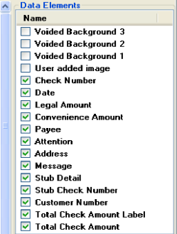
Data Elements
The Data Elements list includes items you can include or exclude from your checks:
Select the checkbox beside items you want include, and deselect the checkbox beside items you do not want. Those items appear or disappear on the canvas.
Hover your mouse over a checked data element in the list to see it highlighted in red on the canvas. This helps you to locate the item.
Options
The properties available in the Options area vary depending on the data element selected.
Name
Name: Modify the name of the data element.
Appearance
Format String: Defaults to O and cannot be changed.
Justify: Click the dropdown arrow to determine how to align the content within the boundaries of the data element.
Location: Click the plus sign to display the element's X and Y coordinates. (Coordinates refer to the location of the item's upper left-hand corner.) You can modify either value to change the item's location on the canvas.
Note: You are also able to drag items across the canvas to change their location.
Size: Click the plus sign to displays the element's height and width. You can modify either value to change the item's size and shape.
Note: You are also able to drag the white squares at the borders of the selected element to change its size and shape.
Behavior
Location Restriction: Click the plus sign to define a rectangular area on the canvas. The upper left-hand corner of the data element cannot be moved outside of this area.
For the X and Y properties, enter the X and Y coordinates of the upper left corner of the rectangle.
To finish defining the area, enter its height and width.
Maximum Size: Click the plus sign and modify the Height and Width values to set the maximum size for the data element on this template.
Minimum Size: Click the plus sign and modify the Height and Width values to set the minimum size for the data element on this template.
Note: The Behavior restrictions can be overridden by changing the values of the Location and Size properties under Appearance.
Number
Maximum Length: Enter the maximum number of digits that can display for this data element. Digits exceeding the maximum length are indicated with a -.
Precision: Enter the maximum number of decimal places that can display for this data element.
Date
Custom Date Separator: Enter the symbol (e.g / or -) that you would like to separate the day, month, and year values. If nothing is entered here, the default date separator for the current culture (based on the template selected) will be used.
Format: Click the dropdown arrow to select a date format.
Four Digit Year: Click the dropdown arrow to select True (all four digits display) or False (only the last two digits display).
Include Separator: Click the dropdown arrow to select True (date separator entered as the Custom Date Separator included in output) or False.
Spacing: Enter the number of spaces to include between characters in the date.
Currency
Custom Decimal: Enter the symbol (e.g. , or .) that you would like to serve as the decimal. If nothing is entered here, the default decimal for the current culture (based on the template selected) will be used.
Custom Separator: Enter the symbol (e.g. , or .) that you would like to separate groups (i.e. of three digits) within the number. If nothing is entered here, the default separator for the current culture (based on the template selected) will be used.
Include if Zero: Click the dropdown arrow and select True (zero amounts display as zeroes) or False (zero amounts display as blank).
Include Separators: Click the dropdown arrow and select True (separator entered as the Custom Separator included in output) or False.
Maximum Digits: Enter the maximum number of digits that can display to the left of the decimal for this data element. Digits exceeding the maximum length are indicated with a -.
Negative Currency Pattern: Click the dropdown arrow to determine how to display negative currency amounts. In all examples, n = amount. You may also select Use Default of Current Culture.
Positive Currency Pattern: Click the dropdown arrow to determine how to display positive currency amounts. In all examples, n = amount. You may also select Use Default of Current Culture.
Show Currency Symbol: Click the dropdown arrow and select True or False.
Text
Character Casing: Click the dropdown arrow to select Normal (maintains letter case of data), Upper (forces all data into upper case), or Lower (forces all data into lower case).
Clip Text: Click the dropdown arrow to select True (only text within boundaries displays) or False (text that exceeds boundaries displays).
Maximum Length (for text fields): Enter the maximum number of characters that can display for this data element. Any character exceeding the limit is truncated and indicated with a -.
Text Color: Click the dropdown arrow to make a selection.
List
Continuation Message: Enter the message that you would like to display if the list continues onto another page.
Edit List: Click the ellipsis button after "Click to edit list." The Format List screen displays.
Uncheck a data element to remove it from the list.
To modify the way an individual data element in the list displays, highlight the element and modify its properties in the Options frame. The properties here function exactly like the properties on the Customize Check Format tab. You may also modify the appearance of the header for each column in the list.
When you have finished modifying the list, click OK.
Print Headers: Click the dropdown arrow to select True or False.
Print Headers Only on First Page: Click the dropdown arrow to select True or False.
Space Between Rows: Enter a number indicating the amount of white space (in points) you would like inserted between each row.
TruncateMessageDataElement: Click the plus sign to view and modify the properties of the message that displays if data in the list is truncated. The message should be entered in the Text property. For descriptions of all other properties, see the sections above.
Underline Headers: Click the dropdown arrow to select True or False.
 `
`