The Drag-and-Drop Email Builder allows you to design and preview custom mobile-responsive emails and include content from the Content Library. You can tailor layouts and templates to align with your brand and customize text color, link color, line height, letter spacing, block options, and more. You can also import and sort visuals through the File Manager.
Note: Campaigns and emails created with the legacy builder are only editable in the legacy builder. You cannot convert them to use the Drag-and-Drop Email Builder instead. When you copy a campaign built with the legacy builder, it remains in the legacy builder. If you want to update an active drip campaign to use the Drag-and-Drop Email Builder, you must end the existing campaign with the Taper Off option, then create a new campaign to replace it once it reaches the Completed status. Refer to Knowledge article 36383 for details.
To access the Email Builder, do one the following:
Follow these general steps to customize your email:
A toolbar always displays at the top of the builder and allows you to modify your view, cancel, or save your changes.
Click Show/Hide Structure in the toolbar to show or hide a dotted line around the blocks in your design.
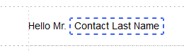
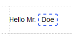
Click Show/Hide Merge Tags Preview in the toolbar to toggle between merge tag names and specific merge tag content.
To navigate through your edit history, click on the Undo, Redo, or History icons that display at the bottom of the canvas when you make a change to your design.
The Undo button remembers your 15 most recent changes during the current browser session.
The History button opens a timeline of your most recent changes. Select a change to navigate to that version of the design. Clicking on an entry in the history timeline highlights the specific block or row you edited to give you context for the change.
Use the desktop and mobile icons at the top of the canvas to switch
between views of your design  .
.
Switching to mobile view reduces the canvas to 320px. In mobile view,
you can use the builder's features just as you would in desktop view,
but columns stack vertically. Settings that can be applied specifically
to the mobile version of the design display a mobile icon in the sidebar .
.
The mobile icon displays in gray If the design contains no mobile-specific settings. Once you make changes to these settings, the icon displays in purple, indicating that some settings apply specifically to the mobile version.