To learn more about this capability, click the Launch video button.
 Minimize Button
To learn more about this capability, click the Launch video button.
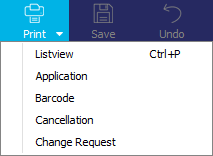
Note: This article contains printing instructions that are only applicable if Applied Epic is installed locally on your computer. If you access Epic through a web browser such as Google Chrome, Mozilla Firefox, or Microsoft Edge, you cannot print directly from within the system. See Printing for more information about the printing capabilities available from Epic Browser. All other steps in this article are applicable to both methods of accessing Epic unless stated otherwise.
Before working in Applied Epic, familiarize yourself with some of the basic functions. These functions enable you to accomplish various program tasks. This section describes the following elements and functions:
Minimize ButtonThe Minimize button is located in the upper right corner of the window. Click this button to reduce the size of the current window to its task bar button. This takes up the smallest amount of screen space.
 Maximize Button
The Maximize button is located in the upper right corner of the window. Click this button to restore the window to 100% size, which takes up your entire screen. After a window is maximized, this button changes to the Restore button.
 Restore Button
The Restore button is located in the upper right corner of the window. Click this button to return the window from its maximized size. After a window is restored, this button changes to the Maximize button.
 Close Button
The Close button is located in the upper right corner of the window. Click this button to close the active window.

The menubar is located in the upper left corner of the window, just below the title bar. Click an option on the menubar to display a list of functions, also known as a menu.

The options bar is located below the menubar. Click these buttons to quickly access the functions available through the menus on the menubar. Options bar buttons are disabled or grayed out when a function is not available for a particular part of the program. Place the cursor over a button in an active window to display the function of the button as a tooltip.
An arrow displays to the right of some buttons. To select an action associated with a button, click the arrow and choose the appropriate item.
You can access the last 20 accounts you opened (regardless of entity
type) by clicking the down
arrow  on the Locate
button. The most recently accessed account displays first. Open accounts
are highlighted in the menu, and the current account displays a check
mark. Click an account to open it.
on the Locate
button. The most recently accessed account displays first. Open accounts
are highlighted in the menu, and the current account displays a check
mark. Click an account to open it.

The Logout button is located on the far right side of the options bar. Clicking this button ends your Applied Epic session and closes all open windows. When you log out, you may be prompted, "Do you wish to close all Applied Epic windows?" If you do not want this prompt to display in the future, select the Do not show this message again checkbox before clicking Yes. You can also specify whether or not the message should display at any point by right clicking the Logout button and checking or unchecking Display Logout Confirmation.
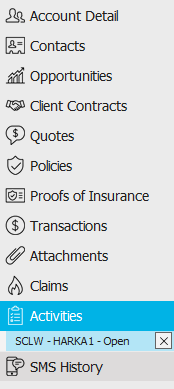
The navigation panel is on the left side of the screen. Click a button on the navigation panel to access that area of the program.

The navigation bar expands to show the available items in the selected area. If an item has a bullet point next to it, click it to show the options that fall under that heading. Click an item to display it on the right. To close all of items beneath a heading, click the "X" to the right of the heading.
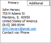
This area in the lower left corner shows contact information for the selected account.
The footer is located at the bottom of the screen. Some of the information it displays varies, depending on the area of Applied Epic you are viewing.

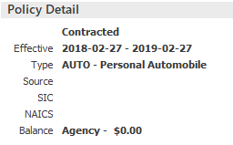
The footer always displays the version of Epic you are running, the database you are accessing, and the name of the current screen. On some account screens, the footer also displays the entity type, status, and current account balance (Client accounts only). The Account Balance displays in red for added visibility.
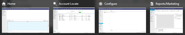
The task bar is located on the bottom of the screen. The task bar displays a task bar button for each program or window currently open.


Click the Applied Epic task bar button to see the screens that are currently in use. Click on a thumbnail of a screen to open it.
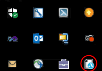
The Applied Epic Notifications icon (circled in yellow below) displays on the right side of the task bar. This button displays messages pertaining to the system.

If your notification area is not set up to show these notifications on the task bar, click the up arrow to access the Applied Epic Notifications icon.
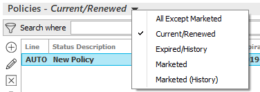
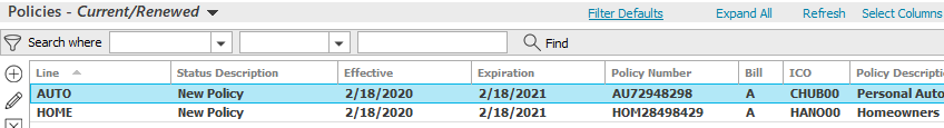
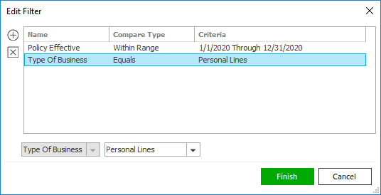
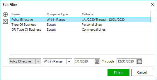
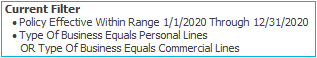
View filters, located between the options bar and the search bar, allow you to change the kinds of items that display in a list. For example, the Policy List view filter allows you toggle between All Except Marketed policies; Current and Renewed policies; Marketed Policies, and Marketed policies in History.
To use the view filter, click on the text and select the appropriate option.
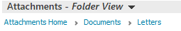
Breadcrumb links, located below a heading, show your current location in a hierarchical structure (such as a folder hierarchy) and allow you to move between levels quickly. Click on a breadcrumb to navigate to its level.
The
search bar above a list allows you to filter the list to display items
that meet specific criteria. You can apply a single
filter (using the search fields) or multiple
filters (using the Edit
Filter button  ), depending on the criteria
you need for your search. The available search criteria vary, depending
on the list. Some criteria allow you to make additional dropdown menu
selections. The search bar displays in blue when filters are applied and
in gray when filters are cleared.
), depending on the criteria
you need for your search. The available search criteria vary, depending
on the list. Some criteria allow you to make additional dropdown menu
selections. The search bar displays in blue when filters are applied and
in gray when filters are cleared.
In
some system areas, the list initially loads blank and you must enter search
criteria to populate it. In these areas, or in areas where you frequently
apply the same filters, you can define filter defaults. Filter
defaults save your preferred view filter and search
filter combination, so that the list defaults to that filtered view whenever
you access it. Filter default functionality varies per system area. For
detailed information on filter default behavior in a specific area, refer
to the help file articles in that area
Your filter defaults are unique to your user code and will not affect other
users’ saved defaults.
Lists show existing items in a given area. Depending on the program area, you may have the option to add, edit, delete, print, or reorder list items. Some lists are paginated (that is, they display a fixed number of items per page); you can navigate from page to page to view additional list items.
You can change the sort order for many lists by clicking the column heading by which you want to sort. Click the column heading again to change the sort order (from ascending to descending or vice versa). To change the information that displays in the list, click the Select Columns link label in the header and select or deselect the columns to include.
Some lists also provide a Refresh link label in the header, so you can make sure you are viewing the most up-to-date information. Refreshing certain lists may remove filters you have applied and restore the Filter Default or an unfiltered view.
Some list columns may contain confidential information. The information in these columns is concealed by replacing the actual values with X's. The number of X's displayed in the column does not necessarily reflect the actual length of the value.
The following buttons display to the left of the lists.
|
Add |
|
Edit/View |
|
Delete |
|
Not all options are available for every list.
Chevrons allow you to roll up items in a list to create more space for other items on the screen, or to merge multiple line items such as transactions, taxes, and fees into one line item.
Click one of these chevrons 
 ,
which display in some list headers, to collapse or expand the entire list.
,
which display in some list headers, to collapse or expand the entire list.
Click one of these chevrons 
 to collapse or expand a list item that contains
multiple line items (such as transactions, taxes, and fees).
to collapse or expand a list item that contains
multiple line items (such as transactions, taxes, and fees).
Link labels display in some section headers. Click these labels to select/deselect all, select columns, change various settings, etc.

Frames group related controls or related information in an area on the screen.
|
|
Tabs allow you to access and enter related information.

Fields are boxes in which you can type information.
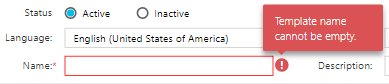
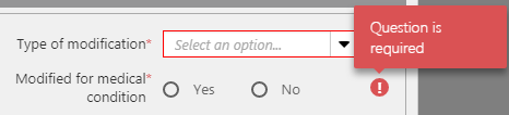
Required fields are indicated by a red asterisk beside the field’s label and/or a red outline:


In some areas of the system, an exclamation mark icon displays if you attempt to navigate away from the current screen without completing a required field. Hover over the icon to view information about the field requirement in a tooltip.
Some fields may contain confidential information. The information in these fields is hidden by replacing the actual values with X's. The number of X's in the field does not necessarily reflect the actual length of the value.
To run spell check in any text field click in the field and do one of the following:
Fields used for phone numbers can automatically format the numbers for you. Enter the number without spaces and tab out of the field. The phone number format will default based on your settings in Regional Settings Configuration and Region and Language.
The country code for your region displays only when focus is on the phone number field.
Proper name fields in Account detail, Contact detail, and some other areas of the system can be capitalized automatically according to the Conditions specified in Auto Capitalization Configuration. If this functionality is enabled, you can enter a name in any case you like, and it will be reformatted according to the Auto Capitalization rules when you click or tab out of the field. Auto Capitalization is applied only when you first enter a name; it does not apply to edits to existing entries. When you edit a name, you must make any capitalization corrections yourself.
If a name is auto-capitalized in a way you do not intend, tab out of the field, click in it again, and update the name manually to override the Auto Capitalization settings.
Auto Capitalization is turned off by default but can be enabled system-wide in Auto Capitalization Configuration.
Click a lookup button  to
the right of a field to search for the desired data.
to
the right of a field to search for the desired data.
Click in a checkbox to select  or deselect
 the option beside it.
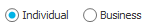
Click a radio button to select the option beside it. You can only select one radio button per group of options.
Required radio buttons display a red asterisk next to their labels.
In some areas of the system, an exclamation mark icon displays if you attempt to navigate away from the current screen without making a required radio button selection. Hover over the icon to view information about the radio button requirement in a tooltip.
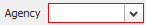
Click the down arrow button next to a field to display a dropdown menu (or dropdown calendar for date fields). The dropdown menu is sometimes referred to as a dropdown box or dropdown list.
|
To jump to a specific item in the list, click the down arrow to the right of the list and enter at least the first letter of the desired selection in the field.
Required dropdown menus are outlined in red.
Click the down arrow button to the right of a date field to display the calendar pop-up window.
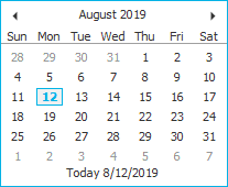
Use the arrows at the top of the calendar to scroll forward or back. Click the selected date on the calendar.
The pop-up calendar defaults to the current system date, which remains bolded even when you choose a different date.
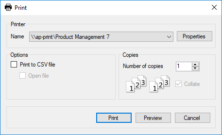
Many of the printing workflows involve the standard Microsoft Windows Print screen.
Most actions in Applied Epic require security access. In order to add a claim, for example, you must first be granted security rights to add a claim. Speak to your administrator about being granted access to areas and/or actions.
 to
add filters.
to
add filters. to locate it in a list.
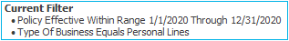


 ,
,  , and
, and  buttons to specify the number
of pages that should display on the screen.
buttons to specify the number
of pages that should display on the screen.