Report Designer
Note: TAM's Report Designer is an integration with Windows FoxPro Report Builder. Some elements of FoxPro are not relevant to TAM based on the differing data structures and functionalities of the two products. Therefore, some fields/options that display on the screen are not implemented in or do not apply to TAM. All of these items are identified throughout this topic and the topics linked below.
The Report Designer screen is made up of the following components:
Menubar
File
- Close: Exit Report Designer.
- Save: Save changes made to the layout.
- Save as HTML: Not implemented in TAM.
- Revert: Revert to last saved version of the report. If you have not made any changes to the layout since the report was last saved, this option is not available.
- Page Setup: Define page layout and print options.
- Print Preview: Preview the printed output as it will look when your data is integrated into the layout.
- Print: Not implemented in TAM.
- Send: Not implemented in TAM.
Edit
- Undo: Undo the last action (can only be used on the last action completed, cannot be used successively).
- Redo: Redo an undone action.
- Cut: Remove the selected object.
- Copy: Copy the selected object.
- Paste: Place a cut or copied object.
- Paste Special: Not implemented in TAM.
- Clear: Remove all selected objects.
- Select All: Select all objects on the layout.
- Find: Not implemented in TAM.
- Find Again: Not implemented in TAM.
- Replace: Not implemented in TAM.
- Insert Object: Not implemented in TAM.
- Object: Not implemented in TAM.
- Links: Not implemented in TAM.
- Properties: Not implemented in TAM.
Format
- Align: The first six options deal with aligning items in relation to each other and therefore are available only when multiple items are selected. The last two options deal with centering items in relation to the boundaries of the report.
-
- Align Left Sides
- Align Right Sides
- Align Top Edges
- Align Bottom Edges
- Align Vertical Centers
- Align Horizontal Centers
- Center Vertically
- Center Horizontally
- Size: The last four options deal with making multiple items consistent in size and therefore are available only when multiple items are selected.
-
- To Grid
- To Tallest
- To Shortest
- To Widest
- To Narrowest
- Horizontal Spacing: Change the amount of space between multiple selected items. Set them to be evenly spaced, or increase or decrease the amount of space between them by 1 pixel.
-
- Make Equal
- Increase
- Decrease
- Vertical Spacing: Change the amount of space between multiple selected items. Set them to be evenly spaced, or increase or decrease the amount of space between them by 1 pixel.
-
- Make Equal
- Increase
- Decrease
- Bring to Front: Bring selected item(s) to the top layer of the layout.
- Send to Back: Send selected items(s) to the background of the layout.
- Group: Select multiple items so that they can be cut, copied, and pasted as a single item.
- Ungroup: Select a group of items and separate them so that they can be moved individually.
- Snap to Grid: If Snap to Grid is selected, a checkbox displays next to it in the Format menu. This means that all placed or moved items will automatically align to the nearest grid line. Grid lines are invisible horizontal and vertical lines corresponding to the rulers displaying across the left and top edges of the Report Designer canvas.
- Set Grid Scale: The Set Grid Scale window displays.
-
- Enter the Horizontal and Vertical values for the grid in pixels. These values determine the number of pixels per inch (the default setting is 12, but you may enter any value between 1 and 48).
- For the Ruler scale (the increments displayed on the horizontal and vertical grid rulers), select System Default (e.g. inches) or Pixels.
- Click OK to apply your changes.
- Font: The Font window displays. Select the Font, Font style, font Size, Effects, Color, and Script for the selected text and click OK.
- Foreground Color
- Background Color
- Text Alignment: The last three options are only enabled if the selected item is multiline.
-
- Left
- Center
- Right
- Single Space
- 1 1/2 Space
- Double Space
- Reading Order: Not implemented in TAM.
- Fill: Select the fill pattern for a selected rectangle or rounded rectangle.
- Pen: Select the type of line/outline for a selected line, rectangle, or rounded rectangle.
- Backstyle
-
Report
- Quick Report: Automatically place selected fields in the Detail band of the report. (This option is only available if the Detail band is currently empty.)
- Run Report: Once you have finished editing the format, run the report immediately, using the Output Destination selected on the Data Preview screen.
- Print Preview: Not implemented in TAM.
- Load Data Environment: Not implemented in TAM.
- Private Data Session: Not implemented in TAM.
- Printer Environment: Not implemented in TAM.
- Optional Bands- See Optional Bands below.
- Data Grouping: Add, modify, or delete data groups.
- Variables: Add, modify, or delete TAM data variables.
- Default Font: Select the Font, Font style, font Size, and Script to be used when printing the report. (You can select an individual item on the layout and click Format, Font to change it to something other than the default.)
- Edit Bands: See Edit Bands below.
- Insert Control: See Toolbar/Report Controls below.
- Properties: See Report Page Setup.
Toolbar/Report Controls
The toolbar at the top of the Report Layout window provides easy access to object functions. The Report Controls box at the bottom of the screen allows easy access to object tools.
Note: You can make this control box available as a toolbar by clicking in the center of the box and dragging the box onto the tool bar menu. Use the Report Control tools to place text, fields, objects, and bands on your report.
The following table describes the main object functions. Click a link in the Function column to jump to that section.
|
Report Layout Window
|
|
Function
|
Description
|
|

|
Data Grouping
|
Add, modify, or delete data groups.
|
|

|
Data Environment
|
Click this icon to pull up the Data Environment window.
Note: Applied Systems does not recommend using Data Environment.
|
|

|
Report Page Setup
|
Define columns/margins and select printing options.
|
|

|
Report Controls Toolbar
|
Display Report Controls icons.
|
|

|
Color Palette
|
Displays colors to change the background and foreground of the report.
On the Color Palette window, click the Foreground Color or Background Color icon and then select a color. To change the colors displayed on the palette or to define custom colors, click the Other Colors icon in the bottom left corner of the window.
|
|

|
Layout Toolbar
|
Displays tools for editing the layout of the report.
Note: The first nine tools listed only apply if multiple elements on the layout are selected. To select multiple elements, press [Shift] while clicking them.
|

|
Align Left Sides |
|

|
Align Right Sides |
|

|
Align Top Edges |
|

|
Align Bottom Edges |
|

|
Align Vertical Centers |
|

|
Align Horizontal Centers |
|

|
Same Width |
|

|
Same Height |
|

|
Same Size |
|

|
Center Horizontally |
|

|
Center Vertically |
|

|
Bring to Front |
|

|
Send to Back |
|
|

|
Font Properties
|
The Font window displays. Select the Font, Font style, Font size, Effects, Color, and Script for the selected text and click OK.
|
|
Report Controls Tool Bar
|
|

|
Select Object
|
Click an item to select it, or press [Shift] while clicking to select multiple items. You can click and drag the selected item to move it, or click and drag the item's borders to resize it. |
|

|
Edit Text
|
Make additions or changes to an item on the layout that contains text. |
|

|
Draw Line
|
Click and drag to draw a line on the canvas. For more information, see Format Lines and Shapes. |
|

|
Define Field and Expression
|
Add fields/expressions to the report via the options on the Report Expression window. |
|

|
Draw Rectangle
|
Click where you would like to place the upper left corner of the rectangle and drag until the rectangle reaches the desired dimensions. For more information, see Format Lines and Shapes. |
|

|
Draw Rounded Rectangle
|
Click where you would like to place the upper left corner of the rounded rectangle and drag until the rectangle reaches the desired dimensions. For more information, see Format Lines and Shapes. |
|

|
Picture/OLE Bound Control
|
Click where you would like to place the upper left corner of the picture and drag until the rectangle reaches the desired dimensions. The Report Picture window displays. |
|

|
Button Lock
|
Lock the current report control so that it can be used repeatedly. For example, if you wished to draw multiple successive lines, you could click the Draw Line icon and then click Button Lock. Every time you clicked on the canvas (until you unlocked the button by selecting one of the other report control icons) you would automatically be able to use the Draw Line tool, without having to click the Draw Line icon between each line. |
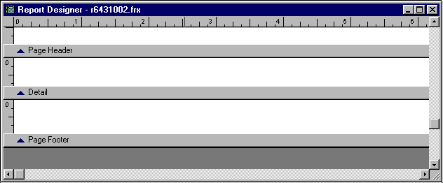
Bands
The Report Designer canvas contains several bands. A band is a distinct region of the work surface bounded by a unique marker bar that extends across the screen. The band marker bar identifies a band and represents its level of organization in the report structure. The band's name displays on the left side of the marker bar. Initially, the screen displays bands entitled Page Header, Detail, and Page Footer. Additional bands are added when groups are added to a report. (See Data Grouping for information on how to add a group band.) Lines in the various bands can be added or removed by clicking and dragging the button on the left of a band marker.
For information on modifying the band layout, see Optional Bands and Edit Bands.
Additional bands are added when groups are added to a report. See Data Grouping for information on how to add a group band.
Descriptions for each type of band are given below.
- Page Header Band: Objects placed in the Page Header band print at the top of each report page. Objects indicate column headings and report page identification information. Only one Page Header band per report is available.
- Page Footer Band: Objects placed in the Page Footer band print at the bottom of each report page. This band is optional. Only one Page Footer band per report is available.
- Title Band: Contains information that appears at the beginning of a report. This is typically used to provide a cover sheet that summarizes the report information. Title bands are added on the Optional Bands screen.
- Group Bands: Each group band comes with a corresponding header and footer. The Group Header band contains information displayed before a group of detail lines are printed. The Group Footer band contains information displayed after a group of lines are printed. It can be used to display group totals and subtotals. The program allows up to 20 levels of Group Bands. See Data Grouping for further information.
- Detail Band: The Detail band displays data from the active database file or view. The information from each record is displayed in the Detail band. This information sometimes results in the display of a row of tabular columns. Add additional detail bands via the Optional Bands screen.
- Summary Band: The Summary band contains information that appears at the end of a report. Report summary information and grand totals typically appear here. Summary bands are added on the Optional Bands screen.
Optional Bands
To add or remove Title, Summary, or Detail bands, on the menubar, click Report, Optional Bands.
- In the Report Title frame, select Title band if you would like to include a title band in your report. To have the title band information print on its own page, click New page.
- In the Report Summary frame, select Summary band if you would like to include a summary band in your report. Select New Page if you would like the summary band information to print on its own page.
- To include the page header on the summary band page, select Page header.
- To include the page footer on the summary band page, select Page footer.
- In the Details frame, adjust the number of detail bands included in the layout. Headers and footers can be added to the detail bands on the Edit Bands screen.
Edit Bands
- On the menubar, click Report, Edit Bands.
- Highlight the band you wish to edit and click OK.
- Make any necessary modifications to the following fields:
- Height: Height of the band. If you wish for this height to be fixed as the layout is modified, select Constant band height.
- Run expression: Not implemented in TAM.
- Detail Properties (available for Detail bands only):
-
- Start on a new column: Insert column break before detail band.
- Start on a new page: Insert page break before detail band.
- Reset page number to 1 for each detail set
- Detail Header/Footer: Determine whether headers/footer bands should be associated to this detail band.
- Reprint detail header on each page
- Start detail set on new page when less than: Determine the minimum length (in inches) that can be printed at the bottom of a page (as opposed to page breaking before the detail band).
- Target alias: Not implemented in TAM.
- When you have finished editing band information, click OK.